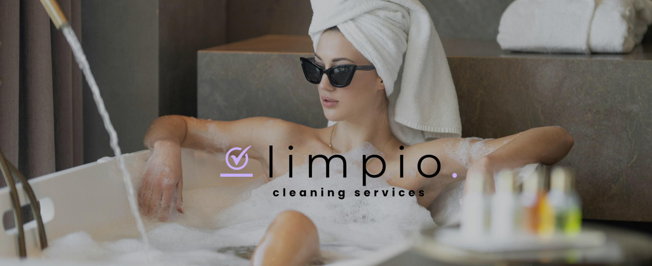
CASE STUDY | LIMPIO CLEANING SERVICES
Limpio Cleaning Services
Limpio is a home cleaning service that wanted to feel less like a chore and more like a treat.
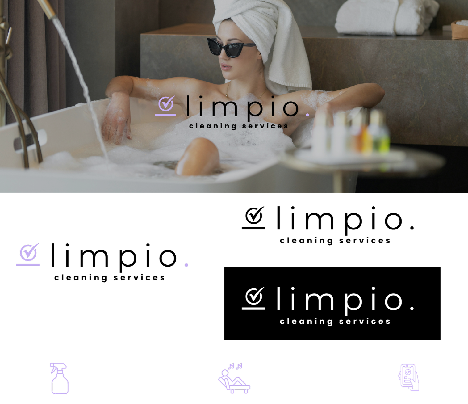
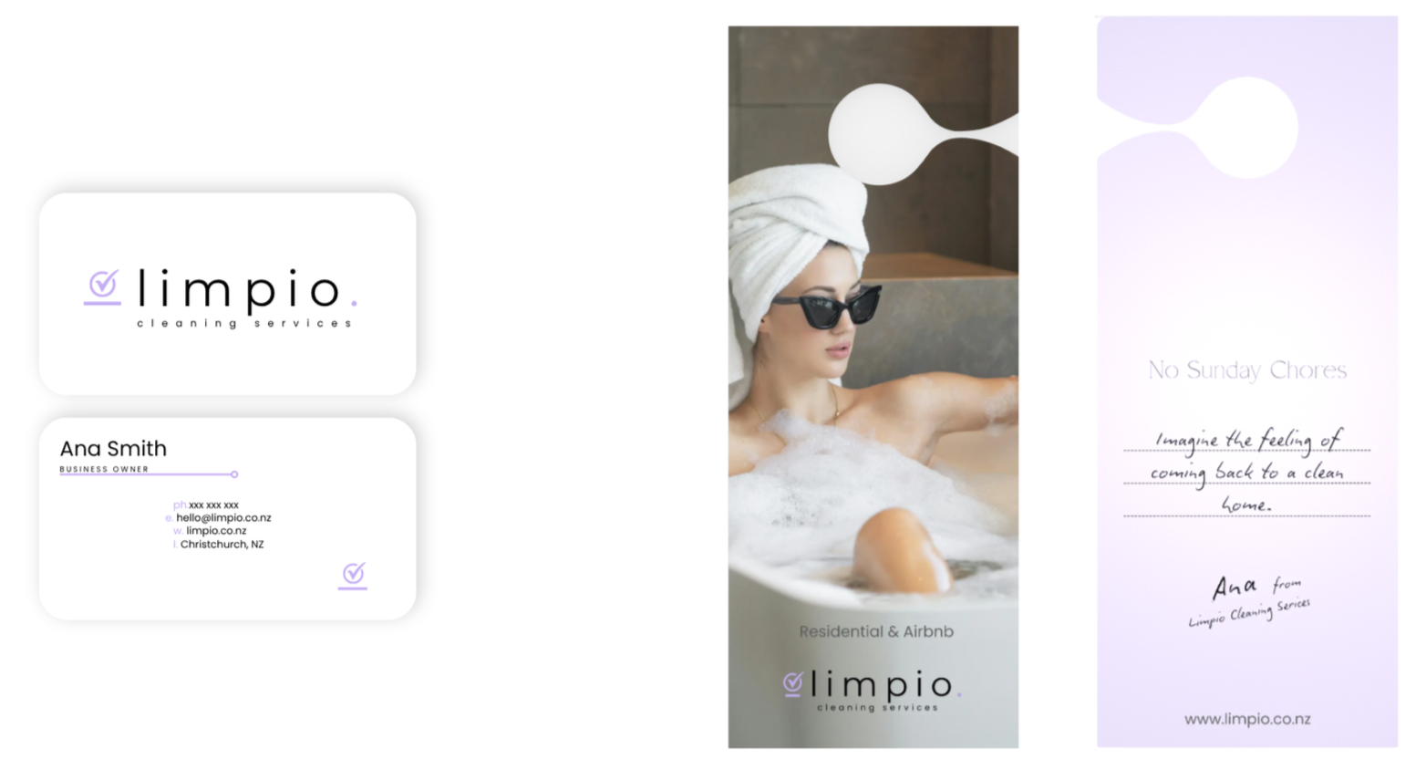
The scope Everything started from the strategy and research I did myself. From there I created the full branding, the logo, and the photography direction.
The brief Most cleaning companies look exactly the same. Clinical, a bit cold, all mops and buckets and bright blue. Limpio wanted to feel calm and premium instead, and to talk to busy people who would much rather spend their free time relaxing than scrubbing the bathroom.
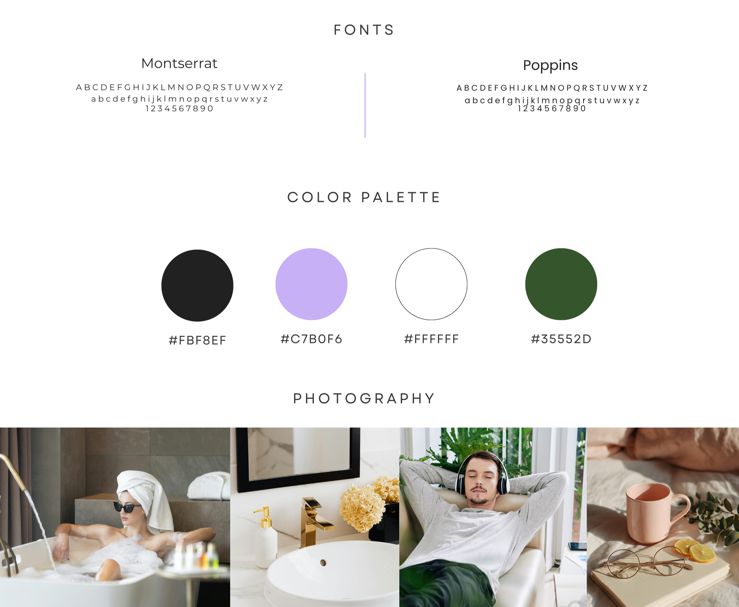
My thinking Nobody actually dreams about cleaning. What people want is the feeling afterwards, a home that is sorted so they can finally switch off. So I built the whole brand around that feeling, not the work. You will notice the photography never shows anyone cleaning. It shows people resting, because rest is what Limpio is really selling. The name helps too. Limpio simply means clean in Spanish, so it is clear and easy to remember without spelling anything out.
What I made The logo is a soft tick, like a little box ticked off, done and sorted. Montserrat carries the clean, modern wordmark, with Poppins adding to the minimalistic design. The palette is where it gets interesting. A calm lilac paired with a grounded forest green, held together by black and white. The lilac keeps it soft and a bit unexpected for a cleaning brand, and the green keeps it feeling fresh and natural.
Limpio does not look like a cleaning company, and that is the point. It looks like something you would happily invite into your home.