
CASE STUDY | NINNA PATRONSKI FASHION
Ninna Patronski
Ninna is an independent fashion label for women who use clothes to say something. It lives somewhere between high fashion and the street, and it has no interest in playing it safe.
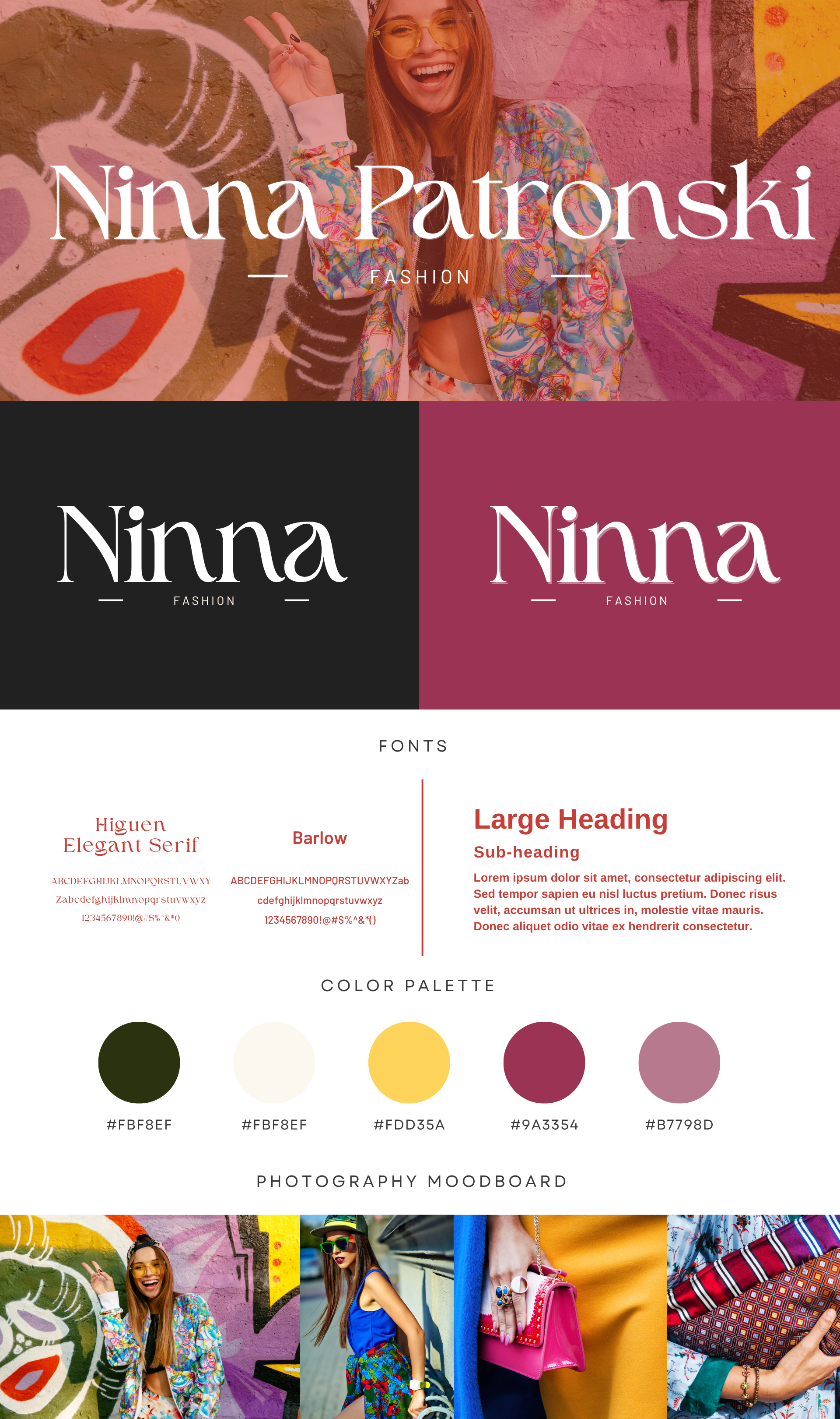
The brief Ninna wanted a brand that looked expensive but never stuffy. Editorial, but still fun. The clothes are loud and full of colour, so the identity had to hold its own next to them without fighting for attention.
My thinking There is a lovely tension in fashion between elegance and attitude, and I wanted the brand to live right in that gap. So I paired a refined serif with photography that is bright, playful, and a bit rebellious. The serif keeps it feeling high end. The imagery keeps it human and alive.
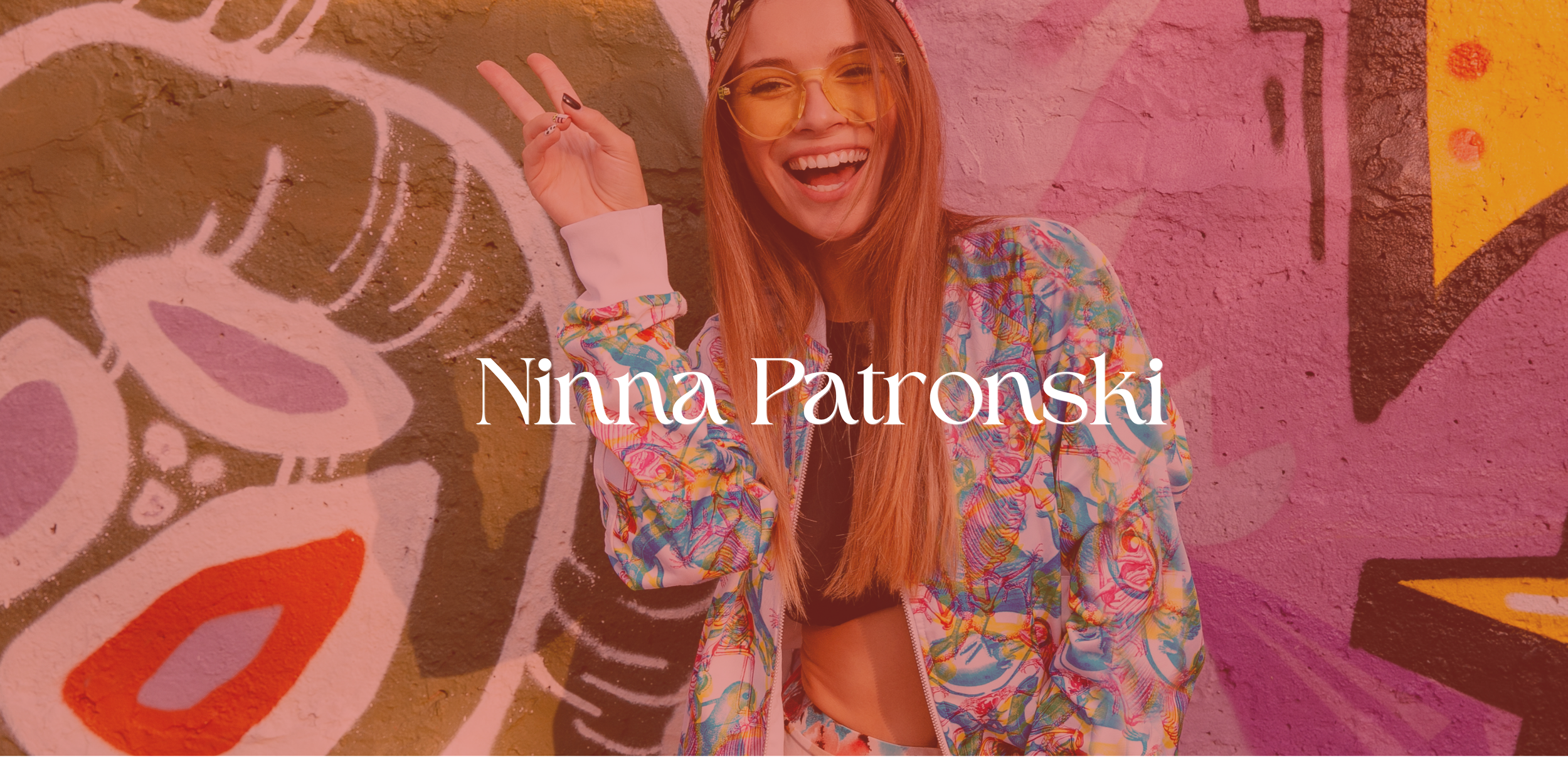
What I made The logotype uses an elegant serif (Higuen) that feels couture, balanced by a clean, modern sans (Barlow) for everything else. The palette is confident: a deep berry, a warm yellow, soft mauve, and cream, all pulled from the world of the clothes. The photography leans into street style, colour, and personality, shot against graffiti and bold backdrops. Together it reads as luxury with a sense of humour.
Ninna does not look like a quiet, minimal fashion label, and that is the whole point. It looks like someone with taste who also knows how to have fun.