CASE STUDY | SANTA CLARA WOOL
Santa Clara Wool
Santa Clara is a knitwear brand that makes everything by hand from merino wool in Uruguay, right down to the hand dyeing. It is slow, careful work, and the pieces are made to last for years.
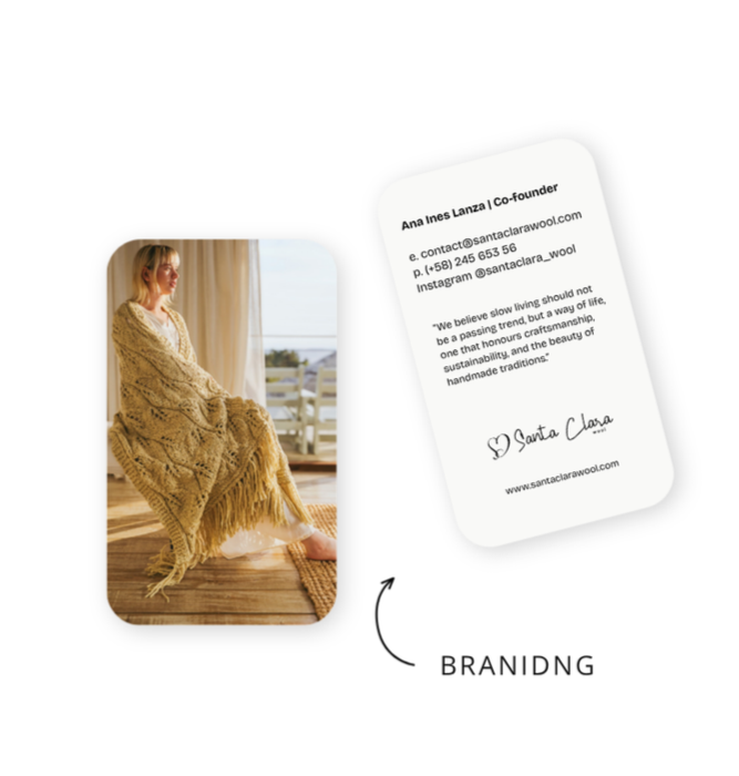
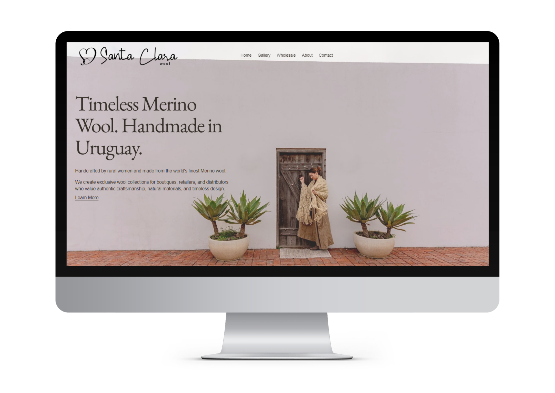
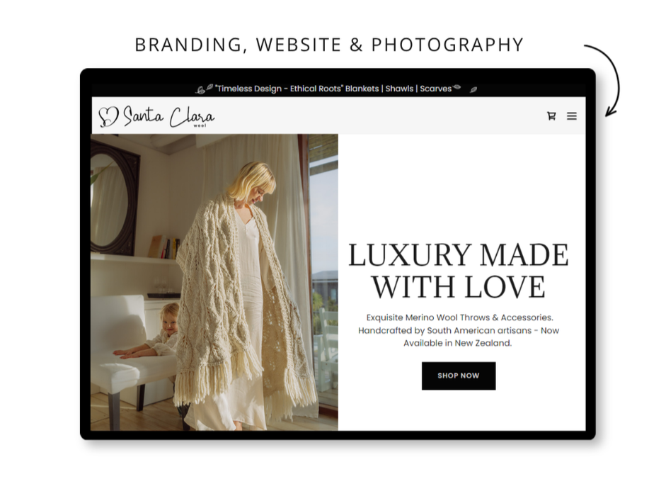
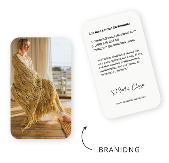
The scope Everything started from the strategy and research I did myself. From there I created the brand name, the slogan, and the full visual identity from scratch, then the product photography, the website, business cards, thank you notes, clothing tags, flyers, and the sales booklets used for proposals.
The brief The goal was to reach people who care about quality and are happy to pay for it. That meant the brand had to feel high end, but never cold. Handmade wool is warm and personal, and the brand needed to feel the same way.
My thinking When something is made by hand, the brand should show the hand. I did not want a slick, mass market look, I wanted it to feel like a signature, like someone actually made this for you. Everything from the logo to the photography was built to feel warm, natural, and quietly premium.
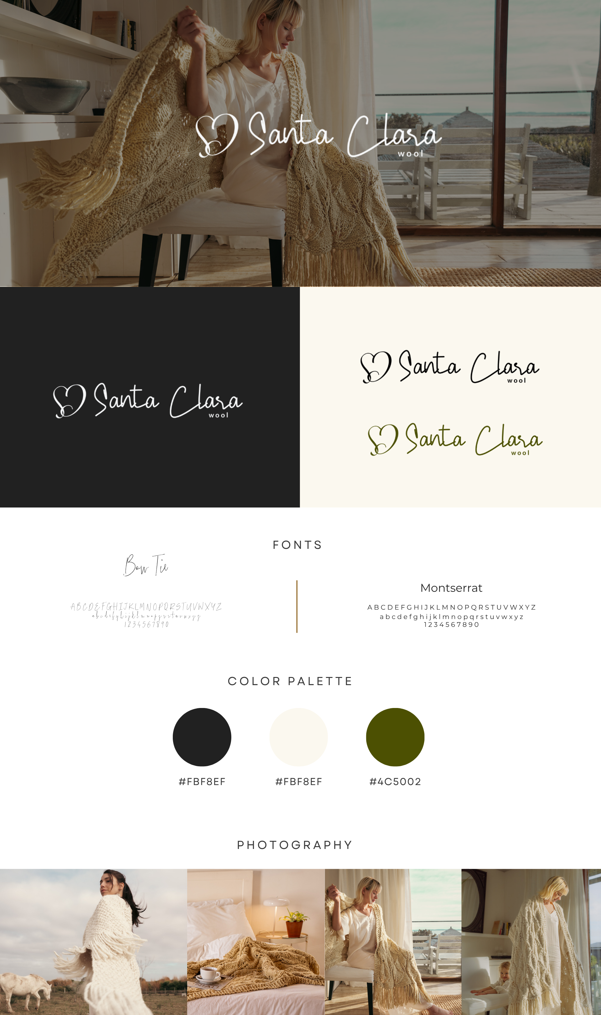
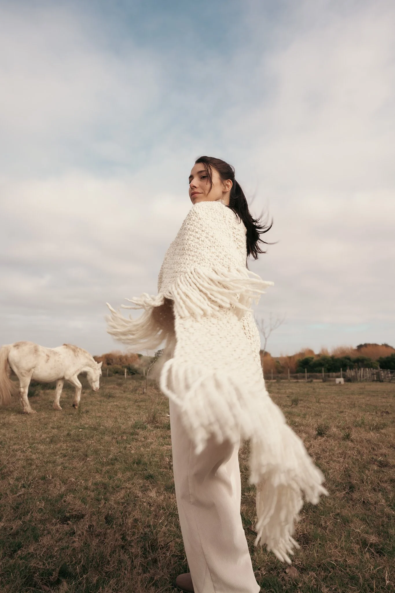
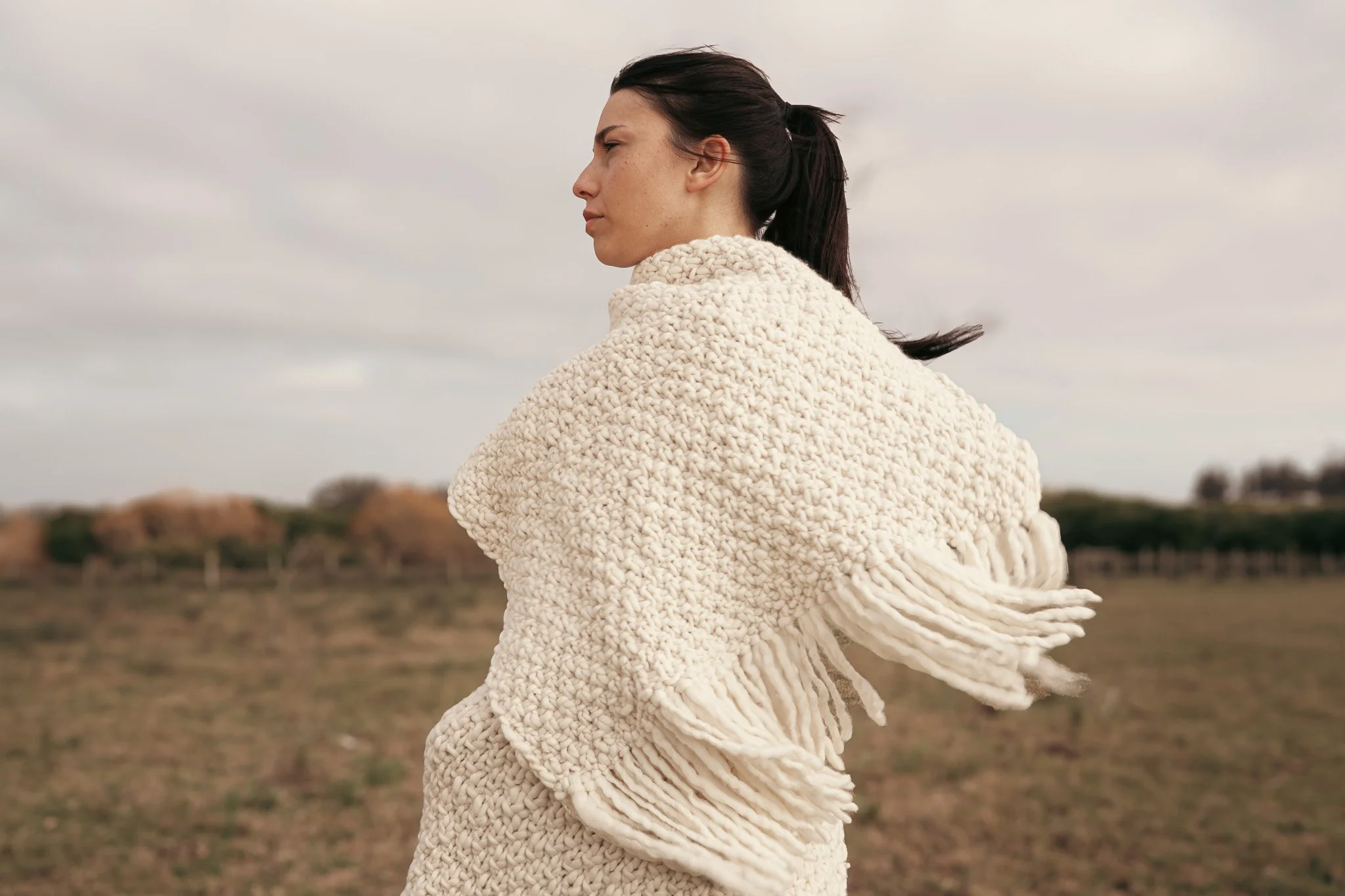
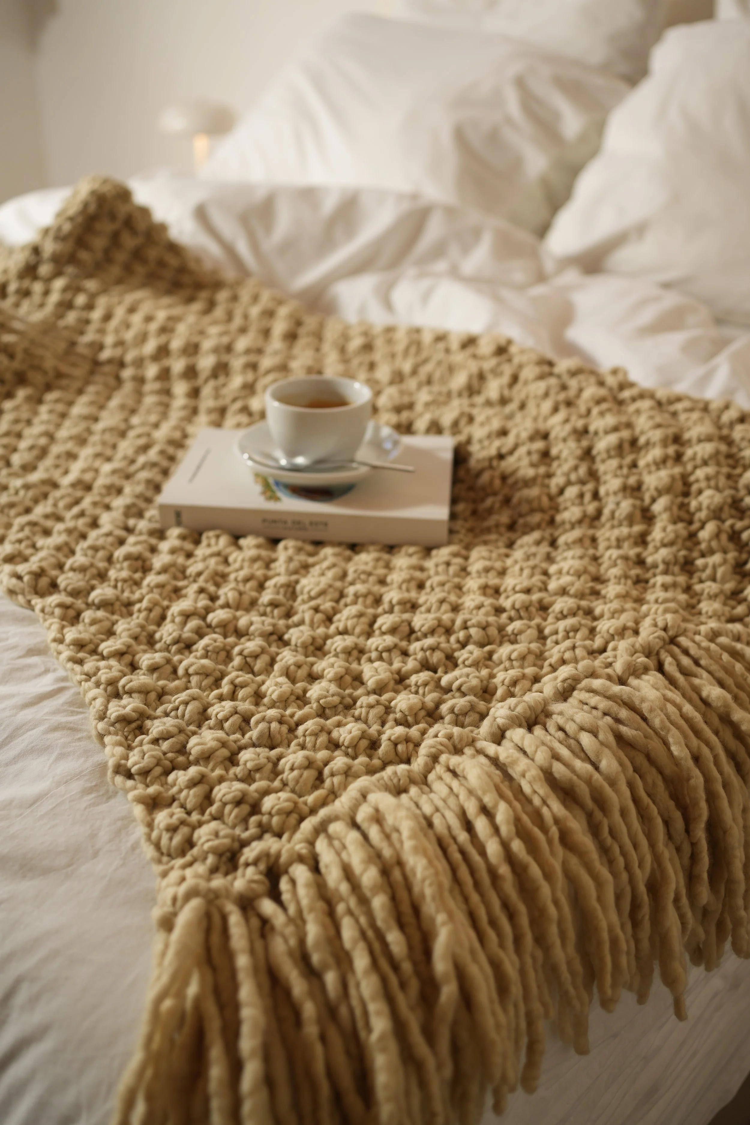
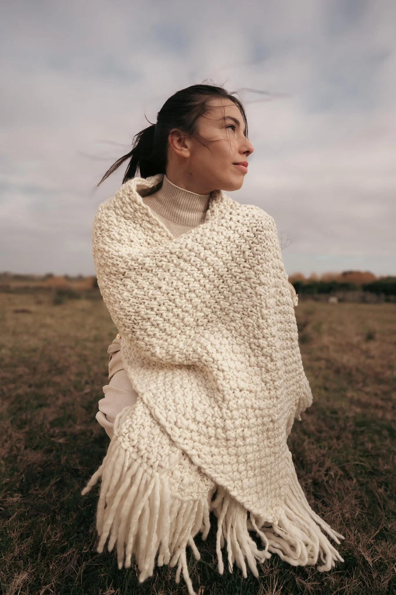
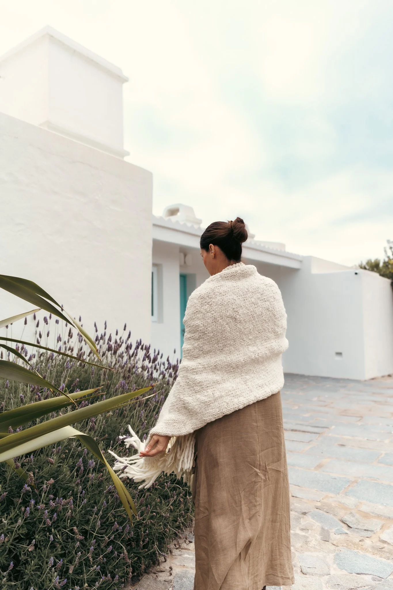
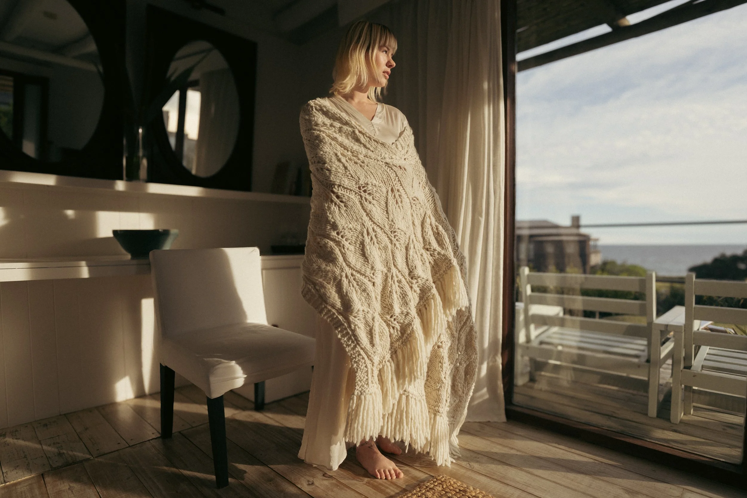
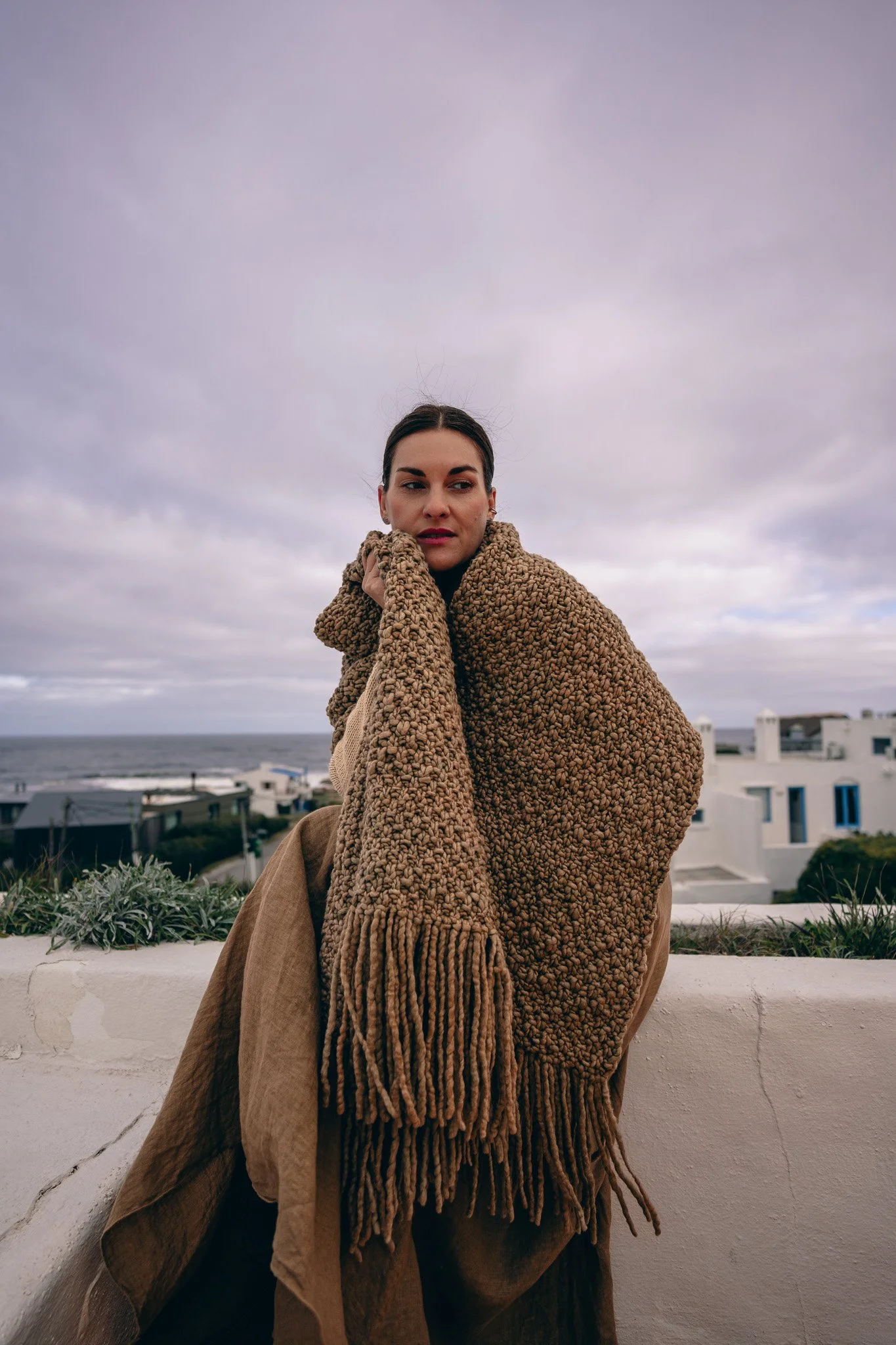
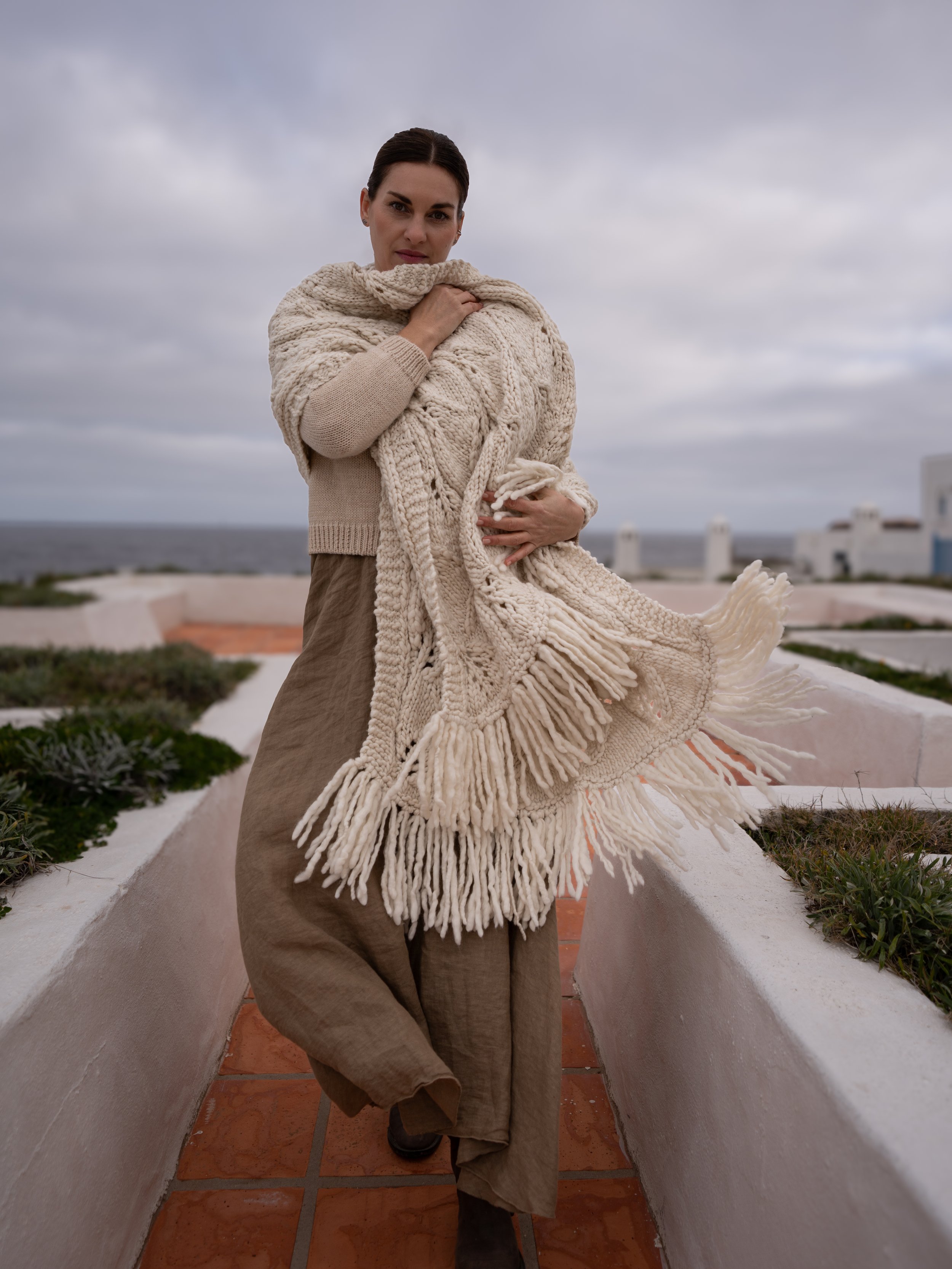
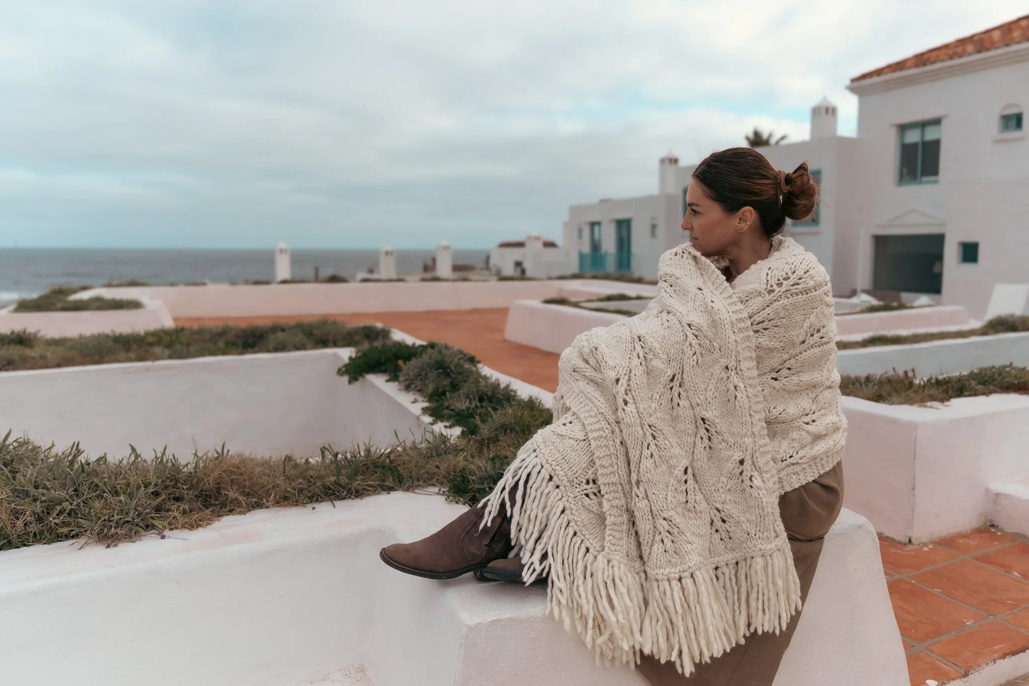
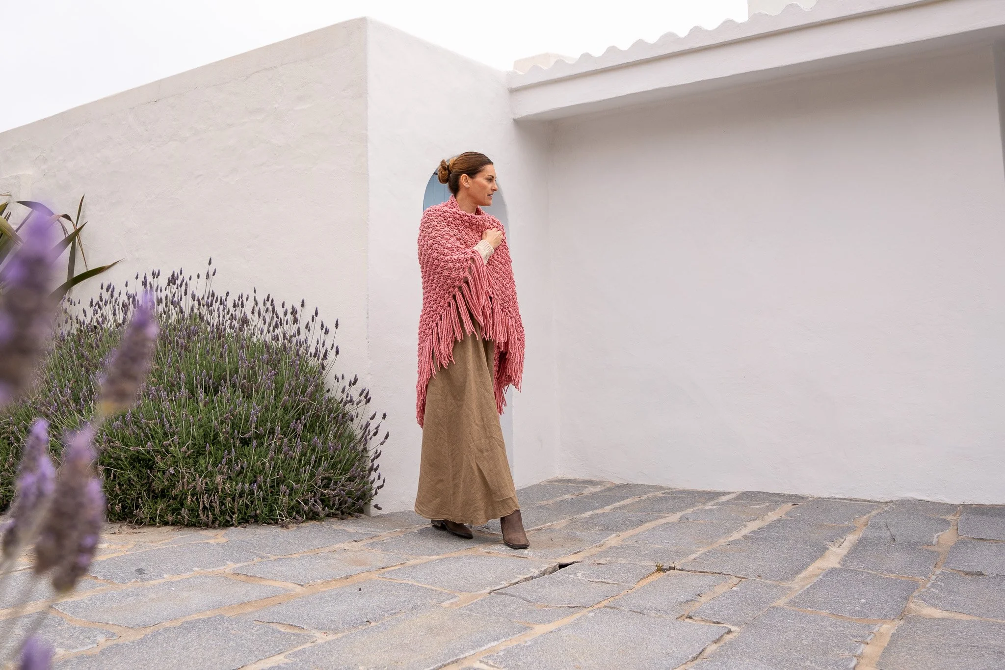
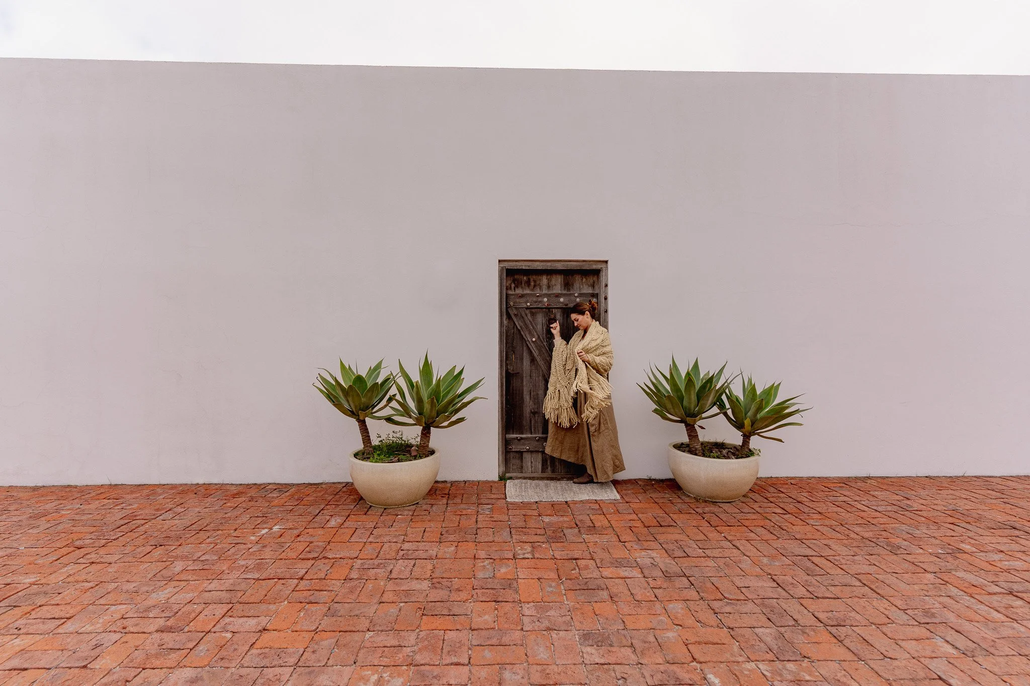
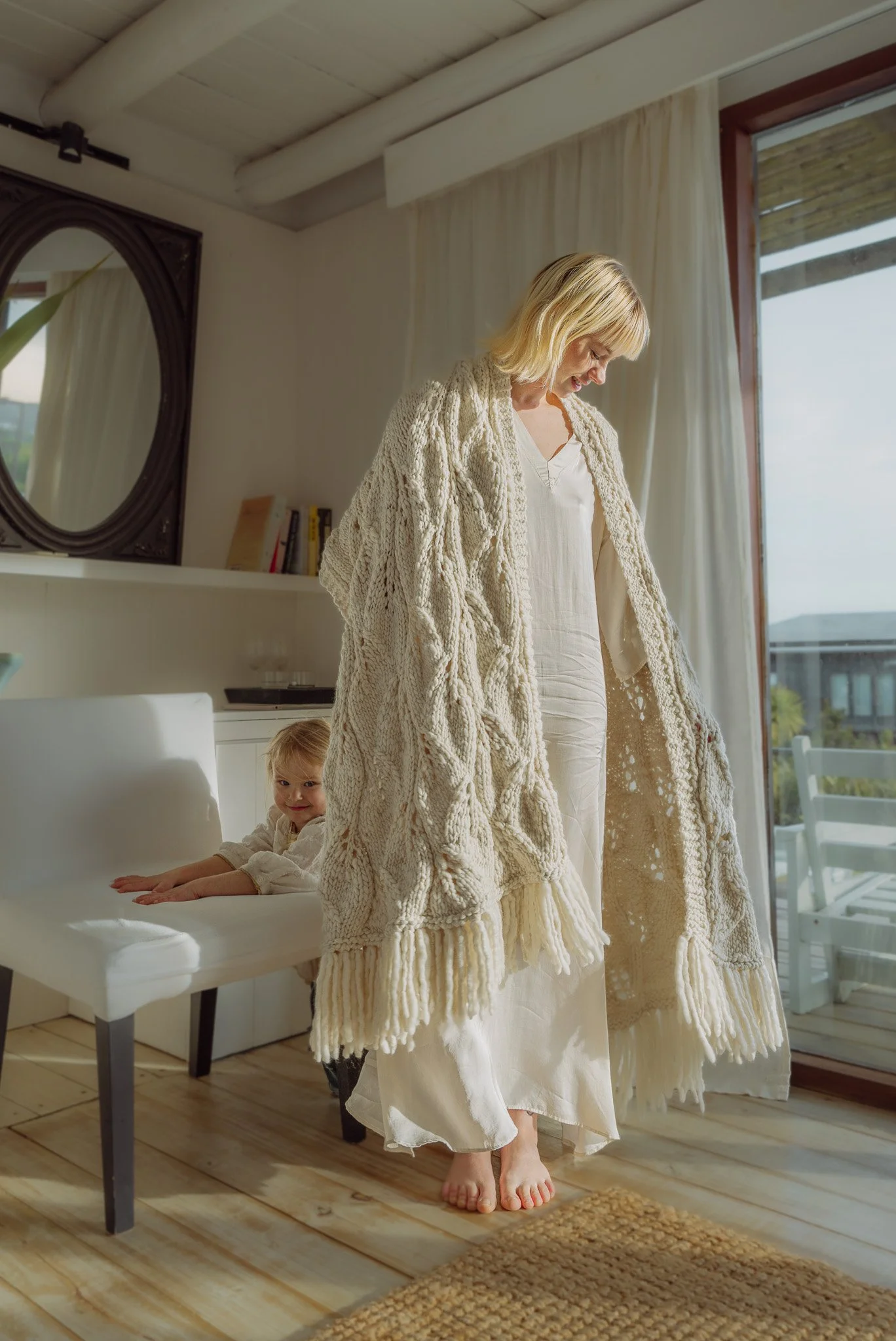
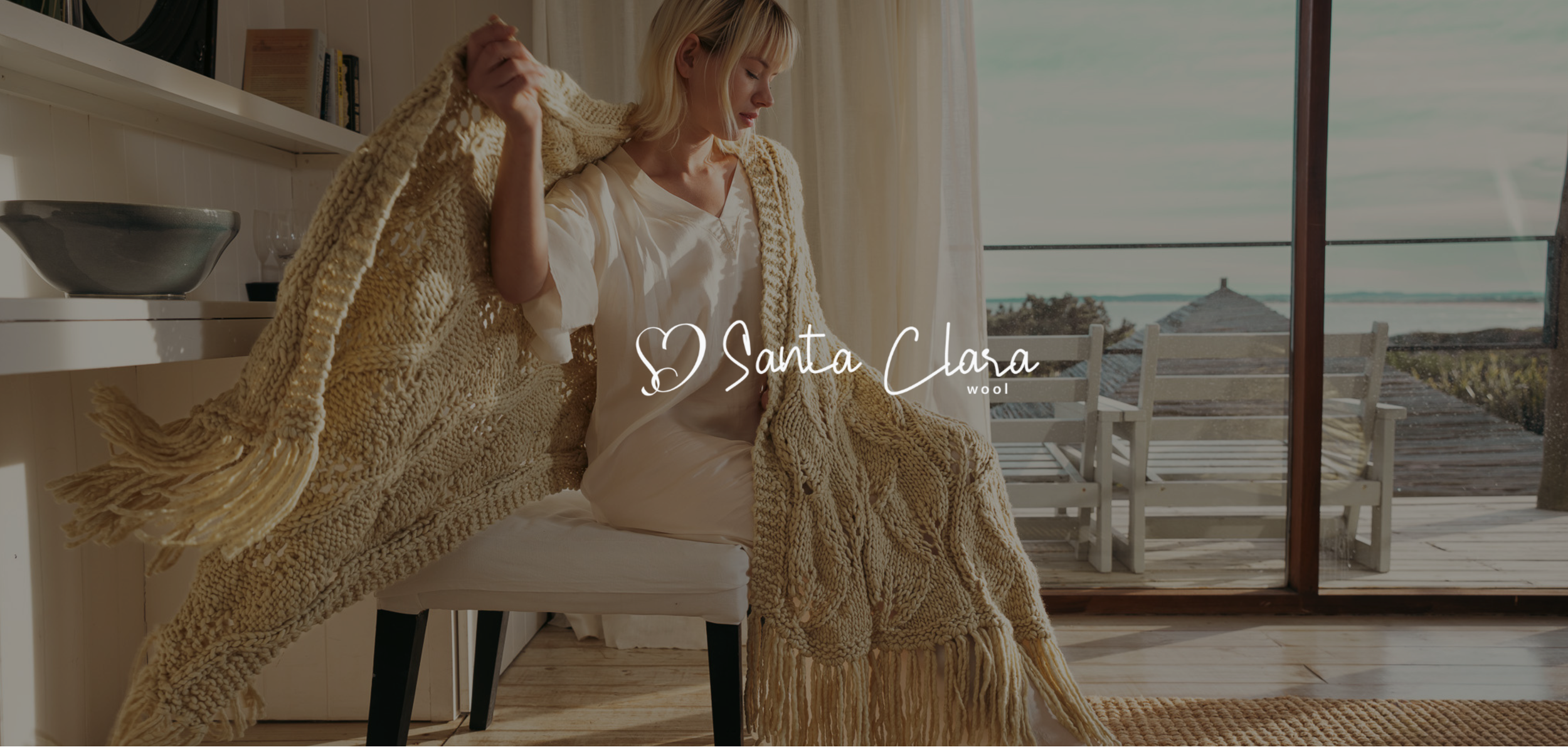
What I made The logo is a handwritten script with a small heart worked into it, so it feels signed rather than printed (Bow Tie for the script, Montserrat for the clean supporting text). The palette stays natural and calm: soft cream, deep charcoal, and an earthy olive green. The photography does a lot of the work here. Warm light, natural interiors, real texture, and models wrapped in the wool at home. It sells the feeling of the product, not just the product.
Santa Clara feels like exactly what it is: something real, made slowly, by hand, for people who notice the difference.