CASE STUDY | UNVAILED LASER CLINIC
UNVAILED Laser Clinic
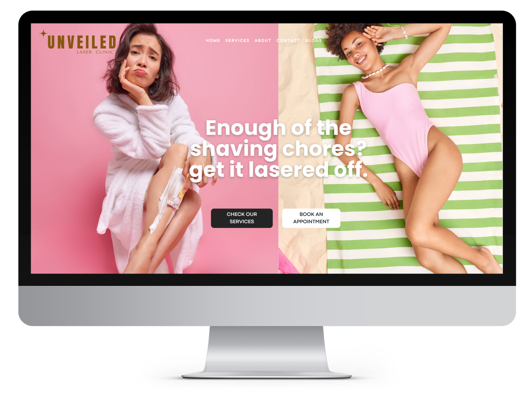
Unveiled is a laser hair removal clinic that wanted to reach younger women, without sounding like a clinic.
The problem When they came to me, nothing about the brand matched. The logo, the colours, and the way they spoke all pulled in different directions. They looked like every other laser clinic in the city, which usually means cold, clinical, and a little boring. That is a hard way to connect with young women who are already tired of being told how their bodies should look.
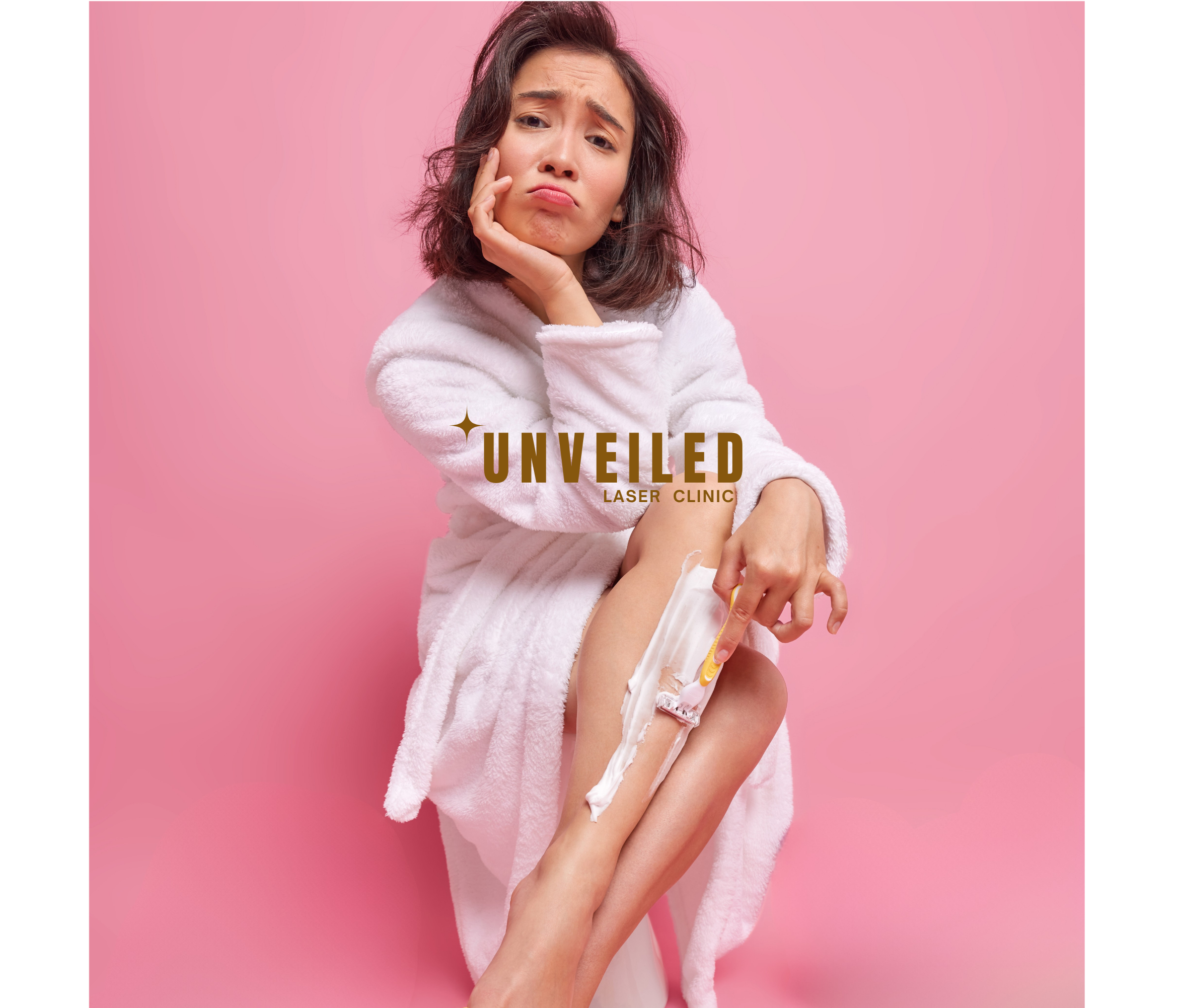
My thinking Most laser clinics sell the same fantasy of flawless, hairless perfection. I wanted to go the other way. Body hair is a normal and slightly annoying part of being a woman, and everyone already knows that. So instead of selling shame, I sold relief. The whole brand talks to you like a friend who is done shaving every single day and just wants it sorted.
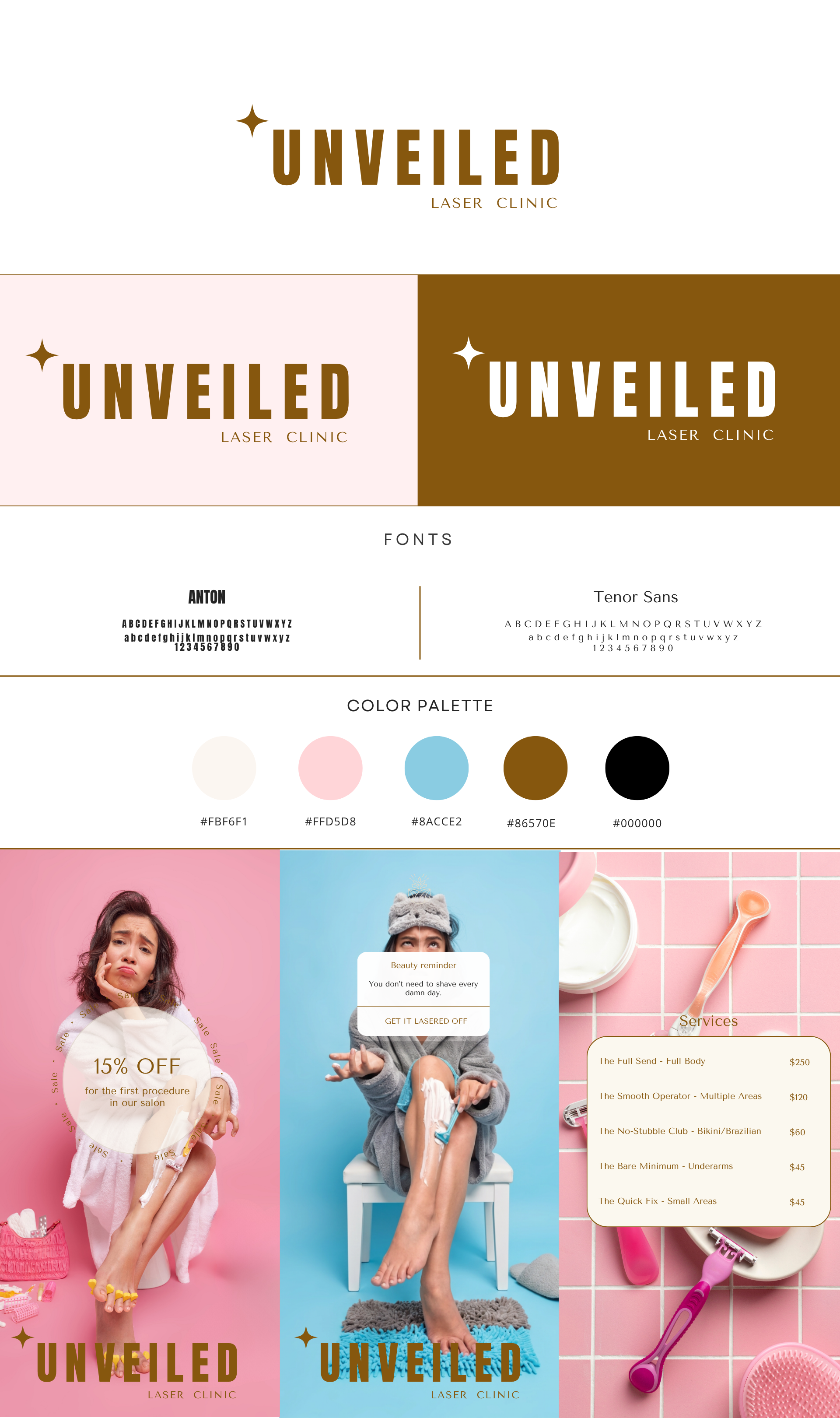
What I made I built a bold, confident identity around a strong headline font (Anton) paired with something calmer for the details (Tenor Sans). The palette mixes soft pink and blue with a warm bronze, so it feels feminine without being sugary. Then I had fun with the words. The service menu reads like a group chat. The reminders are fun and honest. One of them simply says you do not need to shave every damn day.
The result is a personality no other clinic in town has. Warm, funny, and it treats women like people, not projects.